Tuesday, September 11, 2007

My Development Workpieces.

The developmental process for my final artpiece.


  • This is actually a sketch on a rough idea of what am i going to do for this final fusion exercise.
  • However, like i said, this is only a rough sketch. So the final product would not look exactly like this.
  • Moreover, 4R size meant that the measurements were 4'' by 6''. This sketch that i drew resembles more like i would be working on an A3 size canvas.

  • I started off by just adding the outlined faces to photoshop.
  • I made edited the faces to be transparent so that they would blend in with the background colour.
  • Next, i added the background colour and tried at creating a gradient.


  • I started adding in the spiral for the background.
  • Then, i felt that the entire art piece is way too bluey.


  • I added white colour to the spiral so there would be alternate colours of blue and white.


  • I felt that it was kind of weird looking.
  • So, I added borders, hoping to make it look nicer and more appealing.


  • The previous idea did not work.
  • I decided to change the outlined faces by filling up the face with white colour and keeping the neck and shoulders area transparent.
  • I wanted to experiment with different possiblities so ......

  • I arrived at this design.
  • I removed the borders to experiment and see if it would look nicer.
  • Yet, I feel that the gradient of blues were not very obvious.
  • I managed to change the gradient and arrived at the final workpiece!


  • Final Workpiece.
  • I created a gradient for teh background and sticked with the idea of using shades of blue.
  • But then, i realised that including black as part of the gradient would make the workpiece look even better the previous.
  • I stopped experimenting and settled for this piece of work. hahahaha.


The Fusion Workpiece.

The title for my fusion workpiece is "Depression".

I feel that the colour blue, signifies melancholy and sadness so i decided to make use of shades of this colour for my background.

The spiral at the background actually represents that when a person sinks down into depression, the patient's mind would be in a whirl which would result in the patient getting confused all the time. In this state, the patient's temperament and facial expressions would change over time. I drew the expressions signifying sadness, joy, vague impression (blur/ don't know a slightest clue on what's happening around) and anger.

The faces looks as if they got caught in between the spinning spiral, like as if they were stucked there. This adds on to the meaning of the title once again for once you go into a depression, you would be engaged in hallucinations and fake images. The patient is unable to free herself from this but would sink deeper and deeper into it which would result in she going to be stucked down there for the rest of her life.

As you can see, i had the human faces outlined out from the photographs that i have taken and i wanted to make it look like pop art style. Roy Lichertenstein's style was actually said to be "as artificial as possible". meaning that certain details need not be shown or drawn in his art. My style is actually drawing with clean lines and refined colouring towards the abstract arts style.

The combined effect of my style and his would result in:

I try to outline the faces as simple as possible with clean solid lines.

However, not all faces i drew are what i have just mentioned above. the face on the top right hand corner is one exception. i deliberately drew out the shape of the teeth when the subject is smiling.

I combine photography too into this fusion.

But still, i hope to make this art piece a pop art.


--------------------------------------"DEPRESSION"---------------------------------------


My Style.

Review

i think that my works suggest that my style would be drawing with clean-cut lines and using lots of different colours to add on to the drawing. Judging from my 3d art fundamentals models, i believe that my style in that area would be towards the abstract arts.

I conclude that STYLE would be clean and refined colouring the drawing and yet my theme would be towards abstract arts.

Monday, September 3, 2007

Roy Lichtenstein's Works & Style

Go for Baroque [1]


Painting Near Window [1]
Spray [1]


Ten Dollar Bill (Ten Dollars) [5]


Bananas & Grapefruit #1 [1]


In the Car [1]

Jar and Apples [1]


Still Life with Folded Sheets [1]

Dr. Waldmann [1]

Girl with Ball [3]


American (1923-1997) circa 1948 [2]


Two Paintings 1984 [4]


Still Life with Crystal Bowl [1]


Blam [1]


About Roy Lichtenstein & His Style [6]

Roy Fox Lichtenstein (27 October 192329 September 1997) was a prominent American pop artist, whose work borrowed heavily from popular advertising and comic book styles, which he himself described as being "as artificial as possible".

Roy Lichtenstein was born in New York as the son of a realtor and a housewife. Next to Andy Warhol he is considered as THE great artist of the Pop Art movement. The use of familiar subjects like comic strips, bank notes or advertising themes, makes the art of Roy Lichtenstein easily accessible.


His Early Years [7]

Lichtenstein grew up under no specific artistic influence - neither at home nor at school. But at the age of 14 he attended a painting class at Parson's School of Design every Saturday morning. From 1940 to 1943 he studied in New York at the Art Students' League. Then he was drafted to the US Army and served in Europe during War II. Back from the army, Lichtenstein studied at the Ohio State University from 1946 and received his M.A. in 1949. Like Andy Warhol he worked in the commercial graphic business for a while - making designs and decorating shop windows. From 1957 on, he taught at different universities.

Lichtenstein's first experiments with popular images go back to 1956, when he created the famous Ten Dollar Bill print. Then followed a three year period of abstract painting. "Abstract expressionism" was the dominating art movement at that time. Lichtenstein was then in his late thirties and an unknown artist.

The drastic change in Lichtenstein's career came with his first painting in the style of a comic strip. It was a painting of Mickey Mouse and Donald Duck. The story goes, that he painted it for his kids who had provoked him by saying that "daddy could not paint as well as the images in the comic books". So it may have been his own kids, who are responsible for the artist's move into the olymp of art celebraties.


Pop Art Paintings, Sculptures and Prints [7]

Lichtenstein worked a lot with stencils, thus producing rows of oversized dots that should make his paintings or prints look like a huge mass publication product. Although he prepared and executed his works painstakingly like the old masters, he wanted his works of art look like machine made. One of his peculiarities was, that he did not want his brush strokes to be seen.
Other than paintings and sculptures, the artist produced a number of prints for which he used different techniques: lithographs, screenprints, etchings and woodcuts. Often he combined these techniques in one print.

Lichtenstein is usually characterized as ironic, humorous and witty. He openly commented on his own works. The citations below - mostly taken from interviews - show a very sensitive, intelligent and overt personality.


Lichtenstein in His Own Words [7]

"Commercial art had all of the aspects that were needed to get across a new form of painting which just seemed to be interesting".

"All my art is in some way about other art, even if the other art is cartoons."

When asked, if he disliked the title "pop artist", Lichtenstein answered:
"If people use the word pop to differentiate it from art, then I would not like the idea too much. It is inevitable I am going to be called a pop artist. The name is going to stick, no matter what I think."

"I'd rather use the word dealing with than parody. I am sure there are certain aspects of irony, but I get really involved in making the paintings when I am working on them, and I think just to make parodies or to be ironic about something in the past is much too much of a joke for that to carry your work as a work of art."

"I realize there's a difference in style and so forth, but first of all, I think there isn't that big difference between Romantic and Classical artists. There is obviously a difference in emphasis, and I would be more of a Classical artist than a Romantic, I suppose, but then the kind of unity that holds a painting together is really the same whether it's done by Rembrandt or David or Picasso or Oldenburg. There's really not that much difference, there never was."


Literature source used for this Roy Lichtenstein biography


Reference:

Art Sender. (n.d.). Roy Lichtenstein. [WWW page.]. URL http://www.artsender.com/gallery/titles.asp?artistid=1264 [1]

Yahoo Search. (n.d.). Jackson's May 29th & 30th, 1999 Auction. Lichtenstein, Roy. [WWW page.]. URL http://www.jacksonsauction.com/past_files/images/May291999/Lichtenstein.jpg [2]

Flicker. (n.d.). NYC - MoMA: Roy Lichtenstein's Girl with Ball. [WWW page.]. URL http://www.flickr.com/photos/wallyg/562699655/ [3]

Yahoo Search. (n.d.). [WWW page.]. URL http://rds.yahoo.com/_ylt=A9iby6CGN9xGlh4AWzKjzbkF/SIG=12j65mj79/EXP=1188923654/**http%3A//www.hamiltonselway.com/lichtenstein/two_paintings205.htm [4]

Yahoo Search. (n.d.). Art Brokerage. [WWW page.]. URL http://rds.yahoo.com/_ylt=A9gnMiDvPNxGhO0AizSjzbkF/SIG=12m0osuab/EXP=1188925039/**http%3A//artbrokerage.com/artretail/lichtenstein/lichtenstein_36.htm [5]

Wikipedia. (2007.). Roy Lichtenstein. [WWW page.]. URL http://en.wikipedia.org/wiki/Roy_Lichtenstein [6]

Artelino. (2007.). Roy Lichtenstein Biography. [WWW page.]. URL http://www.artelino.com/articles/roy_lichtenstein.asp [7]


My Works.

OUTstanding - 2D Art Fundamentals

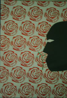
The rose that really stands out with the stem and leaves signifies that it is different from the rest. A rose normally represents love, carrying a positive meaning. However, in this case, it portrays a mysterious feeling to the viewer for a human face is being drawn and coloured black. The rose is a symbol for power and vigor. The black face tells a story of a man who is hungry for power and has a strong desire to succeed. By hook or by crook, he would do anything to accomplish his goals. This drawing focuses on his malice, wrath and strong willpower to get things done in his own way and to stand out from the rest.


Crime Zone (Signage) - Ideation 2

With a little bit of creativity and some brainstorming, i came out with an alternative design for the crime zone sign. I think that i should still stick to the idea of placing a icon of a policeman. The yellow background signifies the typical background signage colour. i did not want to use red for the background for i find it too much in the sense that it makes the entire look of the sign look gordy.


Fast Food (Signage) - Ideation 2

fast food sign. i coloured the background green to signify the meaning of a traffic light flashing the green light when it was time to cars to GO. so i relate GO to the fast speed of the car. i then draw a hamburger (a representative of fast food) on the area where the green light is supposed to be to really signify FAST FOOD.


Blindfold Object VIEW 01 - 3D Art Fundamentals

i was blindfolded when i moulded this piece of clay into what it is now. this view was taken from the top so it's kind of abstrat kind of clay sculpture. it would look like a rose when viewed form this point.


Wall Mural - Ladies' Clothes Department - Ideation 2

i use the clothes such as pants, shirt etc to make up this mural design. you can see that the background consist of the sillouhuettes (think spell wrongly) of a female. i chose orange and yellow as the background colour for for i want to portray females as fun and playful humans. haha. cheerful also..


Wall Mural - Men's Clothes Department - Ideation 2

colour scheme is the manhattan type of colour scheme. this colour scheme creates a warm feeling and the texture of the background adds to this effect. tie, clothes etc refers to men. to further portray that it's a MEN'S CLOTHES DEPARTMENT i added a drawing of a man.


Accident Scene (Signage) - Ideation 2

the blood that flows down results after an accident occured. so the concept of this design would focus on the after effects of an accident. the hand which appear lifeless adds on to create this accident scene.


Character Design - Ideation 2

haha. this is my character design based on 3 words that were given to me at the start of this assignment. elvis said that the character is a peanut. walao.... peanut like worse than a papaya. i created te landscape to be as artificial as possible. like make it like it's an imaginatinn and a fantasy world of colours.


Children's Playground (Signage) s- Ideation 2

haha. i think this signage is quite straight-forward. playground signage of course it concerns children. so one feature of a children's playground would be the rocking animal thingy. a child is riding on this rocky donkey.


Acrylic Painting of Colour Wheel - 2D Art Fundamentals

just an acrylic painting of a colour wheel. this exercise strives for us to try to paint this wheel by testing our colour mixing skills to produce an alternate colour and to try to paint as neatly as possible. the texture in the end has to feel smooth.


Blindfold Object VIEW 02 - 3D Art Fundamentals

blindfold object again. but this is taken from another view. when view at this angle. it would look like a coral or some hilltop road that goes around in circles and circles and circles.